Advanced Excel, Excel
Jul 1, 2026
How to Add a Trendline in Excel Charts
Key Takeaways
- You can add a trendline in Excel by clicking the plus (+) icon next to any chart and selecting the Trendline option.
- Excel offers six trendline types (linear, exponential, logarithmic, polynomial, power and moving average), each suited to different data patterns.
- After adding a trendline, you can format it to display the equation, R-squared value, forecast periods and custom line styles.
- To add a static average or benchmark line, you need to add a separate data series to your chart rather than using the built-in trendline feature.
What Is a Trendline in Excel?
A trendline is a line overlaid on a chart that shows the general direction of your data over time. When looking at a newly created chart in Excel, it can be difficult to tell which way the data is trending, especially when charts are composed of thousands of data points. A trendline solves this problem by using a mathematical formula to calculate and draw a best-fit line across your data, making patterns immediately visible.
Trendlines are essential for business analysis, forecasting and decision-making. Whether you are tracking sales performance, monitoring project timelines or analyzing financial data, adding a trendline to an Excel chart helps you move from raw numbers to actionable insight. Excel can automatically calculate and draw these lines for you in just a few clicks.
Types of Trendlines in Excel
Before you add a trendline, it helps to understand which type best fits your data. Excel offers six trendline types, each designed for a different data pattern.
| Trendline Type | Best For | Example Use Case |
|---|---|---|
| Linear | Data that increases or decreases at a steady rate | Monthly sales growing by a consistent amount |
| Exponential | Data that rises or falls at an increasingly rapid rate | Viral social media growth |
| Logarithmic | Data that changes quickly at first and then levels off | Customer adoption of a new product |
| Polynomial | Data that fluctuates with multiple peaks and valleys | Seasonal revenue patterns over several years |
| Power | Data that increases at a specific rate of acceleration | Manufacturing efficiency improvements |
| Moving Average | Smoothing out short-term fluctuations to reveal underlying trends | Weekly stock price analysis |
Choosing the right type depends on the shape of your data and what you expect to happen next. Linear and moving average trendlines are the most commonly used in business settings.
How to Add a Trendline in Excel
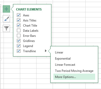
- Click anywhere on your chart and then click the plus (+) icon to access Chart Elements. You can also find the Add Chart Elements button on the ribbon by clicking on your chart, going to Design in the Chart Tools area, and looking under the Chart Layouts section.
- Select the Trendline option.
- You can customize the type of trendline that you want by clicking the right-facing arrow and choosing from the options provided (linear, exponential, linear forecast, moving average, etc.)

How to Add a Moving Average Trendline
The most commonly used trendlines are the basic linear trendline and the moving average trendline. The linear trendline creates a straight line that represents the formula that best fits all of the data points provided. This is a very useful line to use if you believe that the data will continue to follow the pattern in the chart into the future. The two-period moving average trendline is also a very useful line to use. This line, unlike the linear trendline, represents the average trend of a certain number of points on the chart, which you can change. This is very useful if you think that the formula driving the data has been changing over time and is only dependent on a few points that came before it. To create this type of trendline, follow the same steps 1 and 2 above, and then follow these steps:
- Click on the Moving Average trendline option.
- Return to the Chart Elements menu by clicking the plus (+) icon and then click on More trendline options.
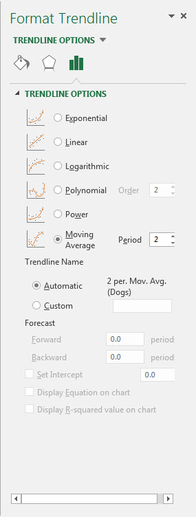
- Make sure Moving Average is selected.
- To the right of the Moving Average selection box, there is a box that says Period. This is the number of periods that are used for the average calculation for your trendline. Select the number of periods that you think your trend in the data lasts for. For example, if you think that you have a trend that only lasts for four data points, select four in this box.
Trendlines are a great way to gain more information about a data set and how the data in that set is changing over time. Moving average trendlines and linear trendlines are the two most common and most useful trendlines used in business.
How to Format a Trendline
Once you have added a trendline, you can customize its appearance and the information it displays. To access formatting options, right-click the trendline on your chart and select Format Trendline (or double-click the trendline directly). The Format Trendline pane will open on the right side of your screen with the following options:
- Display Equation on Chart: Shows the mathematical formula used to calculate the trendline, which is helpful for understanding the exact relationship in your data.
- Display R-Squared Value: Shows how closely the trendline fits your data. A value closer to one means a stronger fit.
- Forecast Forward/Backward: Extends the trendline beyond your existing data points by a set number of periods, allowing you to project future or past trends.
- Line Color and Style: Changes the color, width and dash type of the trendline so it stands out from your data series.
- Set Intercept: Forces the trendline to cross the vertical axis at a specific value, which is useful when you know your starting point should be zero or another fixed number.
These formatting options let you turn a simple trendline into a more informative visual tool for presentations and reports.
How to Remove a Trendline
If you no longer need a trendline on your chart, you can remove it using either of these methods:
- Click the trendline to select it and then press the Delete key on your keyboard.
- Right-click the trendline and select Delete from the context menu.
Both methods instantly remove the trendline without affecting the rest of your chart data.
How to Add a Benchmark or Average Line to a Chart
A static average or benchmark line is different from a trendline. While a trendline shows the direction of your data, a benchmark line displays a fixed horizontal reference value across your entire chart. To add an average line in an Excel chart, follow these steps:
First, calculate the average of your data using the AVERAGE function in a cell outside your chart data (for example, =AVERAGE(B2:B20)). Next, create a new column in your data table and fill every row with that average value. Then select your chart, right-click and choose Select Data. Add the new column as a secondary data series. Finally, format the new series as a straight line with no markers so it appears as a clean horizontal reference across your chart.
This technique also works for adding any benchmark or target line. Simply replace the average value with your target number.
Take Your Excel Skills Further
Trendlines are just one of many powerful charting tools in Excel that can help you analyze data and communicate insights more effectively. Whether you are building dashboards, creating reports or forecasting business outcomes, strong Excel skills make the work faster and more accurate.
Pryor Learning offers hands-on Excel training courses designed for every skill level. Explore Pryor's Excel training options to sharpen your skills and get more from your data.