Charts, Excel
Jul 24, 2026
How to Create an Excel Funnel Chart
Key Takeaways
- Excel offers multiple ways to create a funnel chart, depending on your version, from workaround methods in older releases to a native chart type in newer ones.
- A funnel chart in Excel visualizes stages in a process, such as a sales pipeline or hiring workflow, showing how values decrease at each stage.
- You can download the example file linked below to follow along with each method step by step.
- Once your funnel chart is built, you can customize colors, labels and layout to match your reporting needs.
What Is a Funnel Chart in Excel?
A funnel chart is a chart type that displays values across sequential stages of a process, with each stage typically narrowing from top to bottom. The shape resembles an inverted pyramid, making it easy to spot where the largest drop-offs occur between stages. An Excel funnel chart is commonly used to visualize data like sales pipelines, marketing conversions and recruitment workflows where each stage represents a subset of the previous one.
Newer versions of Excel include a native funnel chart type that you can insert with just a few clicks. Earlier versions require a workaround using stacked column or pyramid charts. The table below summarizes which method applies to your version.
| Excel Version | Method | Difficulty Level |
|---|---|---|
| Excel 2007-2010 | Stacked Pyramid workaround | Moderate |
| Excel 2013 | 3-D Column workaround | Moderate |
| Excel 2016/Microsoft 365 | Built-in Funnel Chart | Easy |
To follow along with any of the methods below using our example data, download Excel funnel chart.xlsx
When to Use a Funnel Chart
A funnel chart in Excel is most effective when your data moves through defined stages with progressive drop-off. If you need to show how a starting value shrinks as it passes through each phase of a process, a funnel chart communicates that story more clearly than other Excel charts and graphs like standard bar or column charts.
Common use cases include:
- Sales pipeline tracking, from initial leads through qualified opportunities to closed deals
- Marketing conversion funnels, such as website visitors to sign-ups to paying customers
- Recruitment and hiring stages, from applications received to interviews to offers extended
- Order fulfillment processes, from orders placed to orders shipped to orders delivered
- Customer support ticket resolution, from tickets opened to escalated to resolved
If your funnel is purely conceptual and not tied to specific data, a SmartArt graphic may be a simpler option. That alternative is covered at the end of this guide.
Create a Funnel Chart in Excel 2016 and Microsoft 365
If you are using Excel 2016 or Microsoft 365, you can create a funnel chart using the built-in chart type. This is the fastest method and requires no workarounds.
- Select your data range, including stage labels in one column and corresponding values in the adjacent column.
- Go to the Insert tab and locate the Charts group.
- Click the Waterfall, Funnel, Stock, Surface or Radar chart icon.
- Select Funnel from the dropdown menu.
Excel will generate a funnel chart automatically. From there you can adjust the chart title, data labels and colors to fit your reporting needs.
Create a Funnel Chart in Excel 2007-2010
The screenshots below were taken in Excel 2010 on Windows 7.
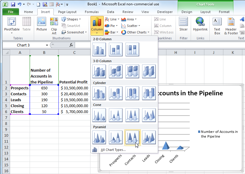
- Highlight the data that you want to incorporate into your chart. This example uses # of accounts in the pipeline.
- On the Insert tab, select a basic 100% stacked pyramid from the Column dropdown button.
- Select the data series by clicking on any datapoint.
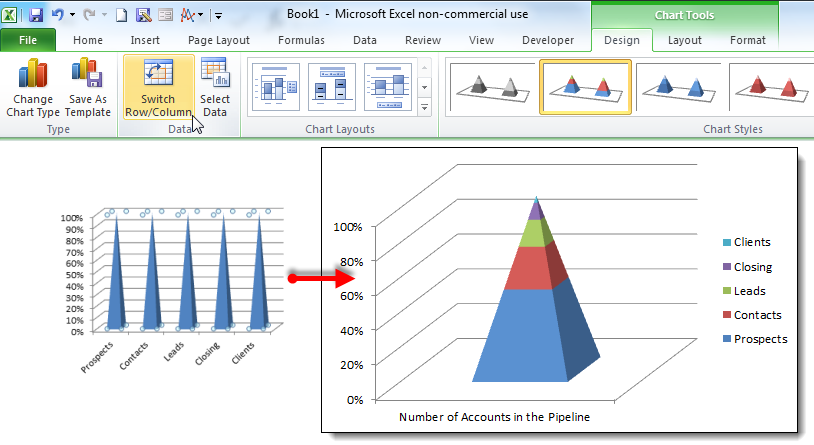
- On the Design tab, click the Switch Row/Column button in the Data group.
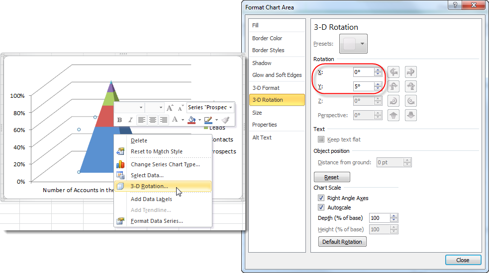
- Right-click on the pyramid and select 3-D Rotation from the fly-out menu.
- Change the X and Y Rotation to 0°.
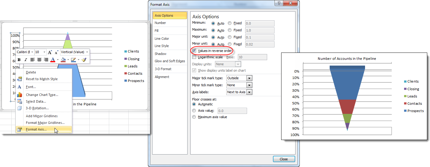
- Right-click on the Vertical Axis and select Format Axis from the fly-out menu.
- Check the Values in reverse order checkbox and you have your funnel chart.
Create a Funnel Chart in Excel 2013
The screenshots below were taken in Excel 2013 on Windows 7.
- Highlight the data that you want to incorporate into your chart.
- On the Insert tab, select a basic 3-D Stacked Column chart.
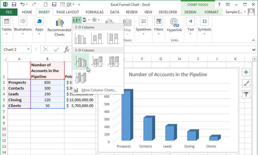
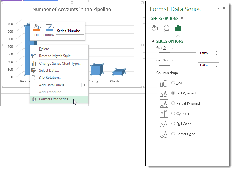
- Right-click on any series columns and select Format Data Series from the fly-out menu. This will open the Format Data Series pane.
- Select Full Pyramid from the Column shape options.
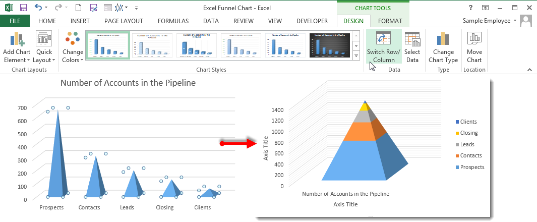
- Select the data series by clicking on any datapoint.
- On the Design tab, click the Switch Row/Column button in the Data group.
- Right-click on the pyramid and select 3-D Rotation from the fly-out menu.
- Change the X and Y Rotation to 0° in the 3-D Rotation section of the Format Chart Area pane.
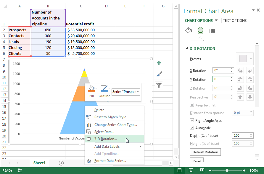
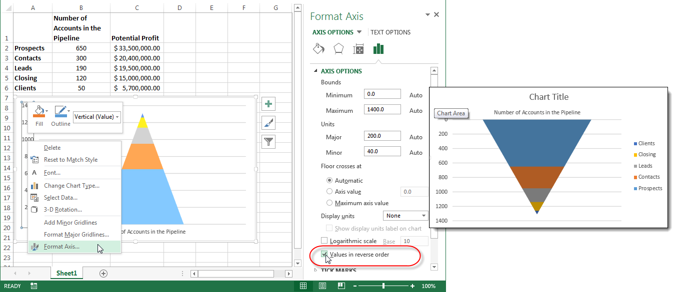
- Right-click on the Vertical Axis and select Format Axis from the fly-out menu.
- Check the Values in reverse order checkbox on the Format Axis pane and you have your funnel chart.
Tips for Formatting and Customizing Your Funnel Chart
Once you have your Excel funnel chart funneling your data in the right direction, you can clean up the chart labels and titles and adjust the design as needed.
A few formatting tips to make your funnel chart look polished and professional:
- Chart title: Replace the default title with a clear, descriptive label such as "Q3 Sales Pipeline" or "Hiring Funnel by Stage."
- Colors: Right-click on individual data points or the full data series and select Format Data Series to change fill colors. Use distinct colors for each stage or apply your organization's brand palette.
- Gridlines and axes: For a cleaner look, remove gridlines and axis labels by clicking the Chart Elements button (the plus icon next to the chart) and unchecking the elements you do not need.
- Data labels: Add data labels directly to each stage so viewers can read exact values without referencing an axis. If your source data also needs visual emphasis, conditional formatting can highlight values that fall above or below key thresholds.
- Sizing: Resize the chart to fit your dashboard or presentation slide by dragging the corner handles or setting exact dimensions in the Format Chart Area pane.
Using SmartArt as an Alternative
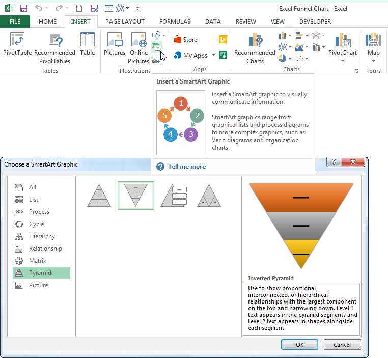
Hint! If your chart is not based on a specific set of data or is only needed to convey an idea instead of numbers, it might be simpler to use a Pyramid SmartArt graphic.
To create one, go to the Insert tab, click SmartArt and select a Pyramid layout from the gallery. You can then type your stage labels directly into the SmartArt text pane. This approach is faster than building a data-driven funnel chart and works well for process diagrams, training materials and conceptual presentations.