Basic Excel, Excel
Apr 6, 2026
How to Create a Time Series Chart in Excel
Key Takeaways
- XY-Scatter charts are the most reliable way to plot time series data in Excel because they automatically create a proper time-scale axis
- For line, column or bar charts with dates, set the axis type to Date Axis to ensure data points are spaced proportionally to time
- PivotCharts offer powerful options for grouping, filtering and analyzing date-based data with Timeline Slicers
- Time data (hours/minutes) does not work with Date Axis on line charts, so use XY-Scatter with lines and markers instead
What Is a Time Series Chart in Excel?
A time series chart is a visualization that displays data points in chronological order, helping you identify trends, patterns and seasonality over time. Whether you call it a time series graph or a time series plot, the goal is the same: to show how values change across a specific time period.
You might use a time series chart to visualize:
- Monthly sales figures to spot seasonal trends
- Website traffic by hour to identify peak usage times
- Temperature readings over a week to track weather patterns
- Stock prices across trading days to analyze market movement
When you plot time series in Excel, the challenge is getting your date or time data to display correctly on the axis. Excel's default behavior can be problematic—it may treat dates as text, space data points unevenly, or choose confusing time increments. The methods below will help you create clear, accurate charts and graphs that communicate your time-based data effectively.
When to Use Each Chart Type for Time Series Data
Before diving into the steps, it helps to understand which chart type works best for your specific data. Here's a quick comparison:
| Chart Type | Best For | Limitations |
|---|---|---|
| XY-Scatter | Continuous time data, time-of-day data, irregular intervals | Less familiar appearance than line charts |
| Line/Column/Bar with Date Axis | Discrete date data with regular intervals | Does not work with time-of-day data |
| PivotChart | Large datasets requiring grouping, filtering or aggregation | Requires more setup; less flexible formatting |
XY-Scatter Charts
Choose an XY-Scatter chart when you're working with:
- Time-of-day data (hours, minutes, seconds)
- Dates with irregular intervals between data points
- Continuous measurements taken at specific timestamps
- Any situation where proportional time spacing is critical
Line, Column and Bar Charts with Date Axis
Choose a line, column or bar chart with Date Axis when you have:
- Date data (not time-of-day) with relatively regular intervals
- Discrete events or measurements tied to specific dates
- Data that benefits from the familiar appearance of a traditional line chart
PivotCharts
Choose a PivotChart when you need to:
- Analyze large datasets with hundreds or thousands of rows
- Group dates by week, month, quarter or year
- Filter data dynamically using slicers
- Compare multiple categories across time periods
Use an XY - Scatter Chart
By far the easiest way to chart time data is to use a scatter chart. Scatter charts will automatically take date or time data and turn it into a time-scale axis. When you select a date or time range and the data associated with it, Excel will take its best guess at organizing the information in the chart with the time-scale on the x-axis.
However, Excel's best guess might not be as useful as you need it to be. In this example, we want to see how, or if, our series data are affected by the time of day. The resulting scatter chart does a nice job of plotting the series data, but the timeline defaults to what seems to be random units of time.
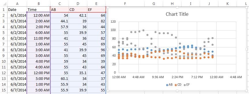
To adjust how the x-axis time-scale is displayed:
- Click on the chart to open the Format Chart Area Pane
- Click on Chart Options and select Horizontal (Value) Axis
- Click the Axis Option Icon
- Open the Axis Options dropdown triangle
- Make changes to the Bounds, Units and so on to adjust the time-scale to display the chart in the manner you wish.
You may have to play with the Units settings to get your scale to show the time increments you want. In this example, we wanted our unit markers to appear every hour and the chart covered 24 hours of data. So, our Unit setting equals 1 / 24 or .04167. A setting of .25 would show Unit markers at 12:00 a.m., 6:00 a.m., 12:00 p.m. and 6:00 p.m.
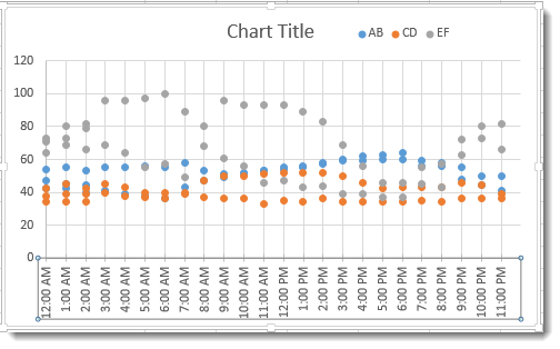
The results are a clean, uncluttered chart that plots series data evenly and clearly across a 24 hour period.

Make Sure Axis Type is Set to Date Axis
When you are creating a line, column or bar chart, Excel will automatically treat date data as a "Date axis". This means that each data point will be plotted on the x-axis based on linear time, rather than equal distance from each other.

AB – Text shows the x-axis set to Text axis and the data points are equally spaced across the chart, even though the dates are not even throughout the month.
AB-Date shows the x-axis set to Date axis and the data points are further or closer together based on when the data was recording during the month. If AB represented bank account withdrawals, you can more easily see in AB-Date that more transactions take place in the middle and end of the month. Follow the steps above to open Axis Options to set your x-axis to Date Axis if Excel's default chart does not do so.
Hint: If your date data is entered as text instead of the Date format, then the Date Axis option will not work. Change your data to the Date format to take advantage of Date Axis.
What about Time Data on Line Charts?
Sadly, as of Excel 2013, the Date Axis feature does not work on Time data in Line, Column, and Bar charts. If you try, you get something like this:

If you need to plot information over time, the easiest solution is to use an XY Scatter Chart and add Lines and Markers to resemble a Line Chart.

Create a PivotChart for Date Data
Pivot tables are among Excel’s most useful tools for analyzing large sets of data. Let’s look at how to visualize the powerful results of a PivotTable in a PivotChart.
Begin by making sure your data is organized properly into a table with no blank rows or columns, column headers, and entered consistently in date or time format (e.g., 6/10/24 15:00:00).
- Place your cursor in the top left cell of your table, then click the PivotChart command on the Insert tab.

- Confirm that the Table/Range is correct in the Create PivotChart dialog, and select the location of your chart. Click OK.

- You will now build your PivotChart by adding fields to the PivotChart areas. In this example we want to see:
a. Sales totals (Order Amount goes in Values are)
b. By month (Order Date goes in Axis area)
c. For each Salesperson (Salesperson goes in Series area)
Excel will automatically group the date data based on the data itself. In this case, it chose to group by Month. The PivotTable is created at the same time as your chart.

Change your PivotChart Date Grouping
If you want a different date interval grouping, click the Group Selection command on the PivotTable Analyze tab, or right-click on the date column and select Group. Choose the grouping format you want in the dialog and click OK.

In this example, we’ve chosen to group by year, then month.

Note that when originally grouped by month, the Sum of Order Amount totaled amounts from each month in all three years included in the dataset. Meaning, January totals include sales from January of 2013, 2014, AND 2015. This is a good way to visualize annual cyclic trends, but might not show growth over time.
You will want to make sure to group of filter your chart data to show the analysis you actually need.
Filter PivotChart Date Data
To filter your chart date data, right-click on the date column and select Filter > Date Filters… In the dialog, choose the method for filtering and the dates you want to include/exclude.
This example has Filtered to show only dates between January 1, 2013 and January 1, 2014.

Add a Timeline Slicer to Your PivotChart
These are also steps for how to group dates by month in a Pivot Table.
1. Select any cell in the date column.
2. On the PivotTable Analyze tab, click the Insert Timeline command.

3. Choose the date field(s) you want to use as your slider.
4. Click OK.
The default slider range will likely be Months. Click the down arrow in the top right corner and choose another grouping, if you like. Slide and click on the timeline to view specific date ranges.

Grouping data within a PivotTable, and especially date-based data, allows you to combine the analysis power of the PivotTable with the familiar tools that make reading the results much more useful. Add the visualization of a PivotChart, and you can easily turn data into meaningful information.
Troubleshooting Common Time Series Chart Issues
Even with the right chart type selected, you may encounter issues with your Excel time axis or date formatting. Here are common problems and how to fix them:
- Dates displaying as numbers (like 45000): Excel stores dates as serial numbers. Right-click the axis, select Format Axis, and change the number format to a date format.
- Uneven spacing on the axis: Your axis type is likely set to Text Axis instead of Date Axis. Open Axis Options and change the axis type.
- Date Axis option is grayed out: Your date data is formatted as text, not as actual dates. Select the date column, go to the Data tab, and use Text to Columns or change the cell format to Date.
- Time-of-day data not spacing correctly on line charts: Line charts don't support time data on a proportional axis. Switch to an XY-Scatter chart with lines and markers.
- Chart showing wrong date range: Check your data for blank cells or text entries mixed with dates, which can confuse Excel's automatic axis scaling.


