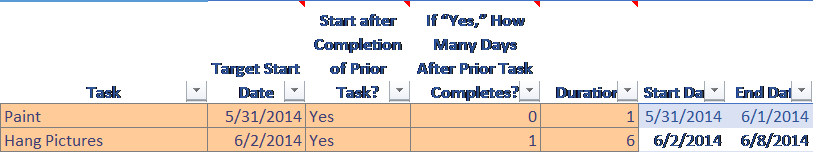
1. Drag your mouse to highlight your data table.
2. From the Insert ribbon, click Insert Bar Chart and select 2D Stacked Bar.
3. Right-click the chart and choose Select Data. Under Legend Entries, in the lower left-hand section of the dialog box, deselect all of the automatically included columns except Start Date and Duration.
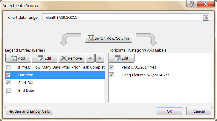
4. Click on Duration and click the down arrow to move it below Start Date.
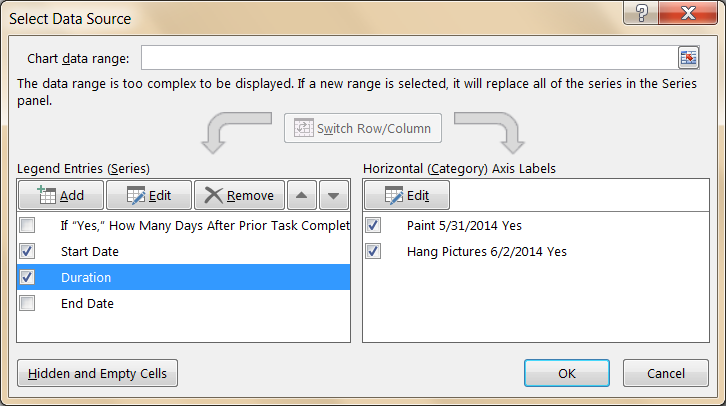
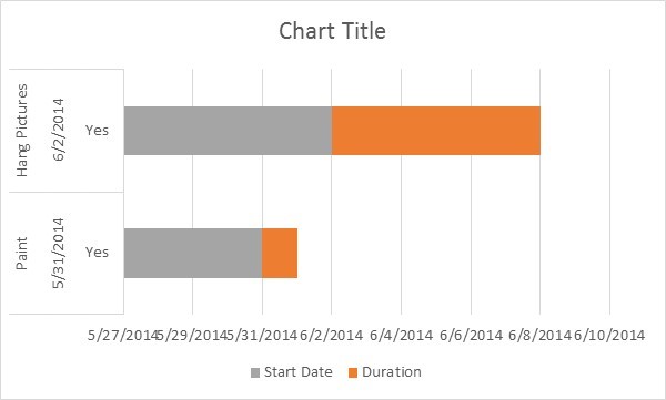
5. Click OK. Your chart should look like this:
6. Before completing the next steps, take a moment to select a format from the Chart Tools | Design ribbon. This is the same chart after selecting Style 11:

7. Next, get rid of the gray bars. Right-click on one of the gray sections and choose Format Data Series.
8. In Microsoft Excel 2013, in the formatting pane, choose Fill & Line and then Fill; or in Microsoft Excel 2010, choose Fill in the dialog box. Choose No Fill.
9. Next choose Border and No Line.
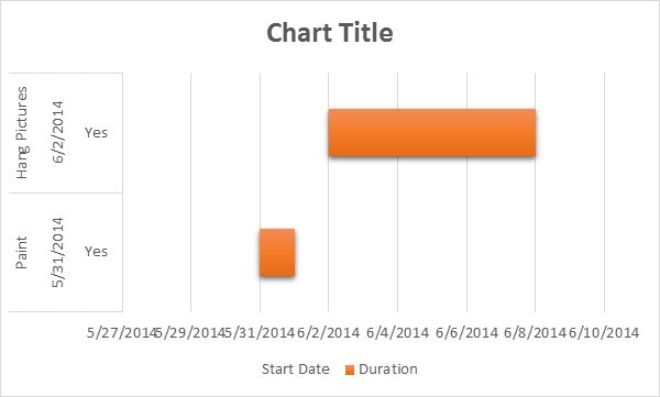
10. Choose Shadow, Glow, and Soft Edges, and in each case choose none. Now the gray bars are invisible.
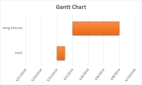
11. Your chart should look like this:
12. Click on Chart Title and change it to the title you’d like to display.
13. Click on the legend at the bottom and press the Delete key.
14. To show the first task at the top of the chart, right-click on the vertical axis (which, in this example, displays “Paint 5/31/2014” and “Hang Pictures 6/2/2014”) and click the checkbox for Categories in reverse order.
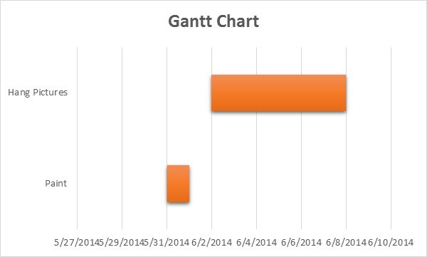
15. Finally, adjust other formatting to your taste. For example, you can adjust the dates on the horizontal axis to avoid running together, remove some of the white space between the chart rows, and change the format of the text on the axes.