The Pareto Principle, named for Italian economist Vilfredo Pareto, suggests that 80% of problems can be traced to as few as 20% of root causes. This can be valuable, even vital information when you are trying to figure out which of many problems to tackle first, or in a complicated troubleshooting environment.
For example, you have just been asked to lead a struggling project team to get them back on track. You ask the team members what their main obstacles have been in terms of meeting objectives and expectations. They make the list, and you analyze it to figure out what the root causes are for each of the problems are that they are experiencing, looking for commonalities.
You apply a ranking to each problem cause based on the frequency that it occurs. In looking at the numbers, you discover that lack of communication between the project workers and the project stakeholders is the root cause of 23 of the main problems the team faces, while the next largest issue, access to necessary resources (computer systems, equipment, etc.), scored only an 11. Other issues drop into the single digits. You realize that by fixing the communication problem you can eliminate a huge percentage of the problems, and by fixing the resource access problems you can clear nearly 90% of the team’s hurdles. Not only have you figured out how to help your team, you’ve just performed a Pareto analysis.
But all that paperwork probably took you some time. Using a Pareto chart in Microsoft Excel could have sped the process up for you considerably.
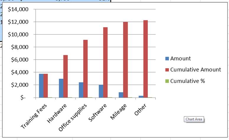
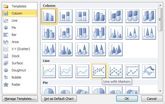
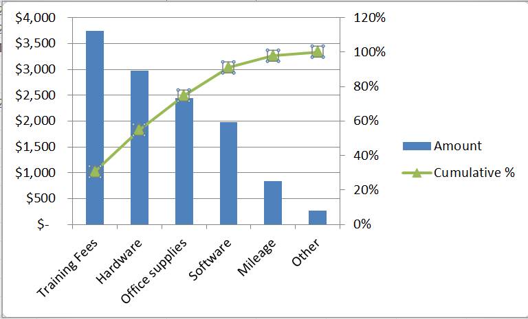
Pareto charts are a combination of a line graph and a bar graph. They are unique because they typically have one horizontal axis (the x-axis) and two vertical axes. This chart is useful for prioritizing and sorting data.
I’m here to walk you through the steps to get your data prepped for a Pareto chart then how to create the chart itself. If you have already formatted your data for a Pareto chart and you can skip down to part two.
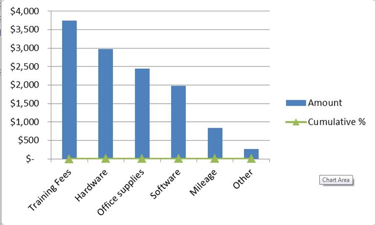
In today’s problem scenario, we have a company that reimburses employee expenses regularly. We want to know where we are spending the most on and how we can reduce that cost by 80% with a quick Pareto analysis. We can find which reimbursements account for 80% of cost and prevent high costs in the future through policy changes, quotes on bulk pricing and a discussion of employee expenses.
Part One: Build Your Pareto Chart Data
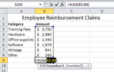
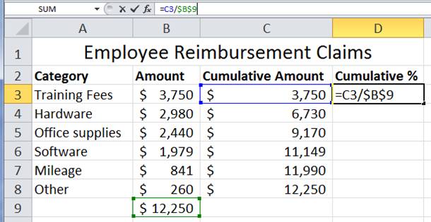
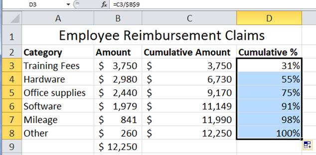
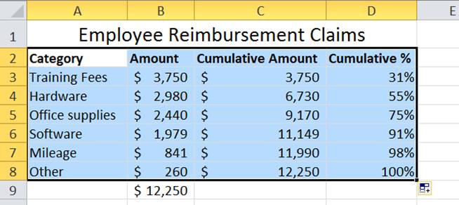
- Set up your data. We have 6 reimbursement categories and the claims amounts in our table.
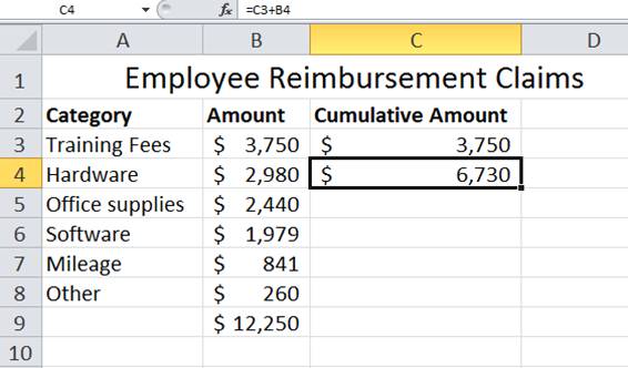
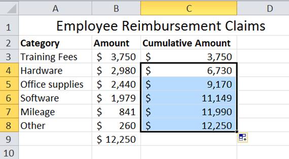
- Sort your data from largest to smallest amount. Be careful to highlight your data in columns A and B to sort accurately.
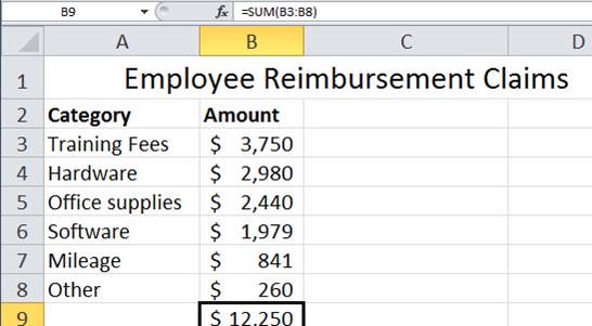
- Use the SUM() function to add your Amount range. In this example, cells B3 through B8 should be added to get our total. SHORTCUT – To sum up a range of values, select the cell B9 and type ALT + “=”. The total here is $12,250.