Charts, Excel
Jul 30, 2026
How to Make a Radar Chart in Excel
Key Takeaways
- A radar chart in Excel (also called a spider chart or star chart) displays multiple variables on axes radiating from a center point, making it easy to compare items across several criteria at once.
- Excel offers three radar chart types: basic radar, radar with markers and filled radar, each suited to different visualization needs.
- Creating a radar chart takes just a few steps: organize your data in rows or columns, select it, then insert the chart from the ribbon.
- Radar charts work best when comparing three to eight variables across a small number of items. Too many variables or data series can create visual clutter.
What Is a Radar Chart in Excel?
A radar chart in Excel is a two-dimensional chart that plots three or more quantitative variables on axes radiating outward from a central point. Each axis represents a different variable and values are plotted from the center (lowest) to the outer edge (highest). The data points for each item are connected by lines, forming a polygon shape that makes it easy to see patterns at a glance.
You may also hear this chart type called a spider chart or star chart because of its web-like appearance. Excel includes radar charts as a built-in chart type, so you do not need any add-ins or special tools to create one. Radar charts are especially useful when you want to visualize how one item compares to another across multiple dimensions simultaneously.
When to Use a Radar Chart
Radar charts are most effective when you need to compare multiple variables for a small number of items. Here are some practical use cases:
- Vendor or product benchmarking: Compare several vendors or products across criteria like cost, reliability, support and features to support data-driven decision making.
- Employee performance reviews: Visualize competency scores across categories such as communication, leadership, technical skills and teamwork.
- Survey analysis: Display respondent ratings across multiple survey dimensions in a single view.
- Financial metrics comparison: Plot key financial indicators for different business units or time periods.
- Academic assessments: Compare student performance across subjects or skill areas.
Excel provides three types of radar charts, each suited to different situations:
| Type | Visual Style | Best Used For |
|---|---|---|
| Basic Radar | Simple connected lines | Clean comparisons with few data series |
| Radar with Markers | Lines with data point indicators | Emphasizing individual data points for precision |
| Filled Radar | Shaded enclosed area | Highlighting coverage or overlap between data series |
Radar charts work best with three to eight variables. Fewer than three makes the chart unnecessary and more than eight creates visual confusion. Similarly, limit the number of data series to avoid overlapping polygons that are difficult to read.
How to Set Up Your Data for a Radar Chart
To create an effective radar chart, structure your data so that categories (the variables you want to compare) are listed in one column and each data series occupies an adjacent column. All values should use a consistent scale so the chart axes are meaningful. Include a header row with labels for each data series.
We are going to create a chart that will help us choose a new phone system for our office. We have gathered information from three different vendors and given each a performance score of one to 100 in eight areas that are important to us such as reliability and maintenance costs. Our table conveys the information, but doesn't really help us understand which vendor might perform best overall, if any do.
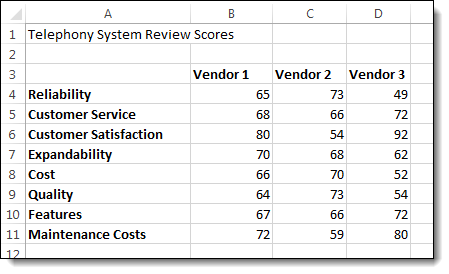
To follow using our example, download Create a Radar Chart.xlsx.
How to Create a Radar Chart in Excel
- Select the data that you want to use for the chart.
- On the Insert tab, click the Stock, Surface or Radar Chart button and select an option from the Radar section. A preview of your chart will be displayed to help you choose.
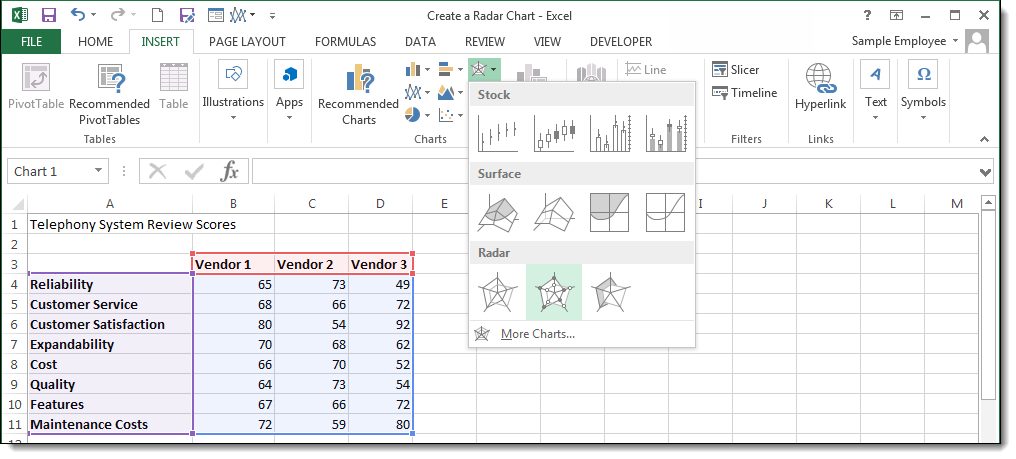
Note: In older versions of Excel, radar charts may be located under the Other Charts button.
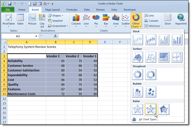
There are three default radar charts you can choose from: Basic Radar, which shows data as simple connected lines; Radar with Markers, which adds data point indicators for precision; and Filled Radar, which shades the enclosed area to emphasize coverage.

Once your chart is created, you can customize the colors, labels and text as you would any chart. Click on the Design and Format tabs in the Chart Tools area to find chart styles and other editing tools.

Tips for Customizing Your Radar Chart
After creating your radar chart, you can refine it to communicate your data more effectively. Here are some practical customization tips:
- Change colors and styles: Right-click any data series and select Format Data Series to adjust line color, thickness and fill. Use contrasting colors so each series is easy to distinguish.
- Add data labels: Click on a data series, then use the Chart Elements button (the plus icon) to toggle data labels on or off. Labels help readers see exact values without referring to the axes.
- Adjust the axis scale: Right-click any axis label and select Format Axis. Set custom minimum, maximum and interval values to ensure your chart accurately reflects the data range.
- Modify gridlines: Use the Chart Elements menu to add or remove gridlines. Fewer gridlines can reduce visual clutter, while more gridlines help with precise readings.
- Reposition the legend: Click and drag the legend to a location that does not overlap with the chart data. You can also right-click the legend and select Format Legend to change its placement.
- Change line thickness: Thicker lines make data series easier to see in presentations, while thinner lines work better for detailed analysis with multiple series.
Common Mistakes to Avoid with Radar Charts
Radar charts are powerful when used correctly, but a few common mistakes can undermine their effectiveness:
- Using too many variables: More than eight axes makes the chart crowded and difficult to interpret. Consolidate or prioritize your variables.
- Plotting too many data series: Overlapping polygons create visual clutter. Limit your chart to three or four data series for clarity.
- Using inconsistent scales: If one variable is measured on a one-to-10 scale and another on a one-to-100 scale, the chart will be misleading. Normalize your data before charting.
- Choosing a radar chart when a bar chart would be clearer: For simple, single-variable comparisons, a bar chart is often more intuitive. Reserve radar charts for multivariate analysis.
- Neglecting axis labels: Without clear labels on each axis, readers cannot interpret what the chart is measuring. Always label every spoke.
Advantages and Limitations of Radar Charts
The radar chart is one of those "love it or hate it" tools. This is probably because there is some data that it works really well for, and for some it merely creates confusion and annoyance. The trick is to use it sparingly, and only on those specific tasks to which it is most suited.
Advantages:
- Provides a visual comparison of multiple variables at a glance, making it easy to spot overall strengths and weaknesses.
- Displays multivariate data in a compact format that would require multiple charts with other chart types.
- Highlights patterns and outliers quickly, especially when comparing two or three items side by side.
Limitations:
- Can become confusing when too many data points or series are plotted, reducing readability.
- Area perception can be misleading because the visual size of a polygon depends on the order of variables around the chart.
- Not ideal for reading precise values since data points are plotted along radial axes rather than a linear scale. For precise value scanning, conditional formatting can be a more effective approach.