Advanced Excel, Excel
Feb 26, 2015
How to Add an Average Line in Excel Charts for Trending Data
When looking at a newly created chart in Excel, it can be difficult to tell which way the data is trending. These charts are often composed of thousands of points of data. Sometimes we can tell which way the data is moving over time, but other times we have to use some of the features of Excel to tell us what is happening. This can be accomplished with trend lines and moving average lines. Trend lines are more commonly used to see which way the data is moving in a chart. These lines can be automatically calculated and drawn in Excel when you use the following steps.
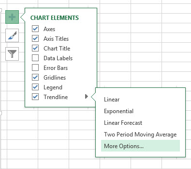
- Click anywhere on your chart in Excel 2013 and then click on the plus symbol to get to your chart elements. You can also find the Add Chart Elements button on the ribbon by clicking on your chart, going to Design in the Chart Tools area, and looking under the Chart Layouts section.
- Select the Trendline option.
- You can customize the type of trend line that you want by clicking the right-facing arrow and choosing from the options provided (linear, exponential, linear forecast, moving average, etc.)

The most commonly used trend lines are just the basic linear trend line and the moving average trend line. The Linear Trendline creates a straight line that represents the formula that best fits all of the data points provided. This is a very useful line to use if you believe that the data will continue to follow the pattern in the chart into the future. The Two Period Moving Average trendline is also a very useful line to use. This line, unlike the linear trend line, represents the average trend of a certain number of points on the chart, which you can change. This is very useful if you think that the formula driving the data has been changing over time and is only dependent on a few points that came before it. To create this type of trend line, follow the same steps 1 and 2 above, and then follow these steps:
- Click on the Moving Average trend line option.
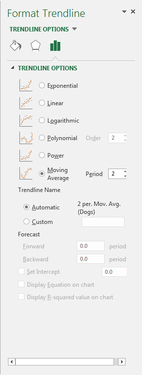
- Follow steps 1 and 2 once again and then click on More trendline options.
- Make sure Moving Average is selected.
- To the right of the Moving Average selection box, there is a box that says Period. This is the number of periods that are used for the average calculation for your trendline. Select the number of periods that you think your trend in the data lasts for. For example, if you think that you have a trend that only lasts for 4 data points, select 4 in this box.
Trend lines are a great way to gain more information about data set and how the data in that set is changing over time. Moving average trend lines and linear trend lines are the two most common and most useful trend lines used in business.