Management, Supervision & Leadership
Apr 28, 2026
How to Make a Pareto Chart in Excel
Key Takeaways
- A Pareto chart combines a bar graph and a cumulative percentage line to help you identify the most significant factors in a data set using the 80/20 rule.
- Excel 2016 and later versions include a built-in Pareto chart you can insert in just a few clicks.
- For more control, you can build a Pareto chart manually by sorting your data, calculating cumulative percentages and combining a bar chart with a line on a secondary axis.
- Avoiding common mistakes like unsorted data and missing cumulative percentages ensures your chart accurately highlights the vital few causes.
A Pareto chart in Excel helps you pinpoint which problems or categories have the biggest impact so you know where to focus your efforts first. In this guide, you'll learn how to create a Pareto chart using both the built-in option (Excel 2016 and later) and the manual method that gives you full control over formatting and data preparation.
What Is a Pareto Chart?
A Pareto chart is a specialized combination of a bar graph and a line graph. The bars represent individual values sorted in descending order, while the line tracks the cumulative percentage across all categories. Together, they make it easy to see which factors contribute the most to a total.
Teams widely use Pareto charts in quality management, root-cause analysis and business decision-making. Any time you need to prioritize where to direct resources or attention, a Pareto analysis can help you cut through the noise.
Common use cases include:
- Quality control and defect tracking
- Customer complaint analysis
- Expense category review
- Project management and risk prioritization
- Process improvement initiatives
The 80/20 Rule Explained
Italian economist Vilfredo Pareto inspired the Pareto Principle, which states that roughly 80% of effects come from 20% of causes. In practice, this means a small number of categories often account for the majority of problems, costs or defects. A Pareto chart makes this relationship visible at a glance, helping you identify the "vital few" causes that deserve your attention first.
When to Use a Pareto Chart
A Pareto chart is the right tool when you want to:
- Identify which defect types cause the most production failures
- Determine which expense categories drive the bulk of your budget
- Prioritize customer complaints by frequency or cost impact
- Focus improvement efforts on the issues that will deliver the greatest return
- Communicate data-driven priorities to stakeholders in a clear visual format
How to Create a Built-in Pareto Chart in Excel
If you're using Excel 2016, 2019, 2021 or Microsoft 365, you can create a Pareto chart in just a few clicks. Excel handles the sorting, cumulative percentage calculation and secondary axis automatically.
- Enter your category labels in one column and their corresponding values in the adjacent column.
- Select both columns of data.
- Go to the Insert tab on the ribbon.
- Click Insert Statistic Chart (the icon with a histogram shape).
- Choose Pareto from the dropdown menu.
Excel generates a fully formatted Pareto chart with bars sorted in descending order and a cumulative percentage line on a secondary axis.
Limitations of the Built-in Pareto Chart
The built-in version is fast, but it comes with trade-offs. Excel automatically bins your data, which can group categories in ways you didn't intend. You also have less control over formatting, axis labels and the placement of reference lines. For detailed Pareto analysis or presentations that require a polished look, the manual method gives you much more flexibility.
How to Prepare Your Data for a Manual Pareto Chart
In our example scenario, we have a company that reimburses employee expenses regularly. We want to know where we are spending the most and how we can reduce that cost by 80% with a quick Pareto analysis. We can find which reimbursements account for 80% of cost and prevent high costs in the future through policy changes, quotes on bulk pricing and a discussion of employee expenses.
Here is the sample data we'll work with:
| Category | Amount | Cumulative Amount | Cumulative % |
|---|---|---|---|
| Training Fees | $3,750 | $3,750 | 30.6% |
| Hardware | $2,900 | $6,650 | 54.3% |
| Office Supplies | $2,100 | $8,750 | 71.4% |
| Travel | $1,800 | $10,550 | 86.1% |
| Software | $1,200 | $11,750 | 95.9% |
| Meals | $500 | $12,250 | 100.0% |
Sort Your Data in Descending Order
Sorting is critical for a valid Pareto chart. The bars must go from largest to smallest so the cumulative percentage line rises correctly from left to right. To sort in Excel, highlight your category and amount columns, go to the Data tab and choose Sort Largest to Smallest on the amount column. Be careful to select both columns so your categories stay aligned with their values.
Calculate Cumulative Amounts and Percentages
You need two additional columns to build the chart: Cumulative Amount and Cumulative Percentage. The cumulative amount shows a running total, and the cumulative percentage shows what share of the grand total you've accounted for at each step. The final cumulative percentage value should always equal 100%.
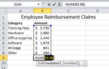
1) Set up your data. We have six reimbursement categories and the claim amounts in our table.
2) Sort your data from largest to smallest amount. Be careful to highlight your data in columns A and B to sort accurately.
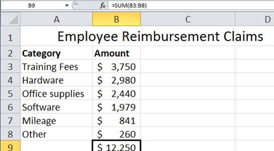
3) Use the SUM() function to add your Amount range. In this example, cells B3 through B8 should be added to get our total. SHORTCUT - To sum up a range of values, select the cell B9 and type ALT + "=". The total here is $12,250.
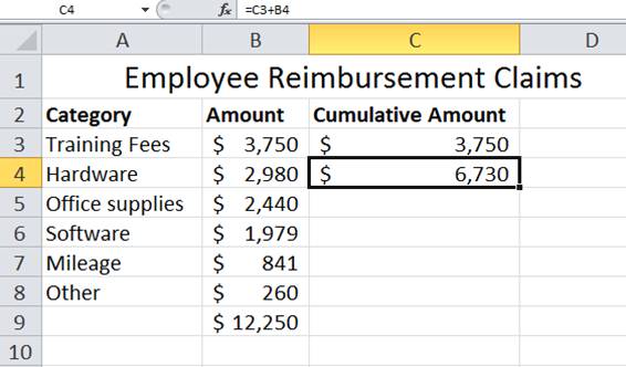
4) Create a Cumulative Amount column. Start with the first amount, $3,750 or B3. Each amount builds on the one before it. In C4, type "=C3+B4" then press Enter.
5) To automatically fill the rest of the column, double click the Autofill Handle.
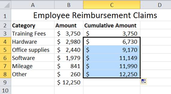
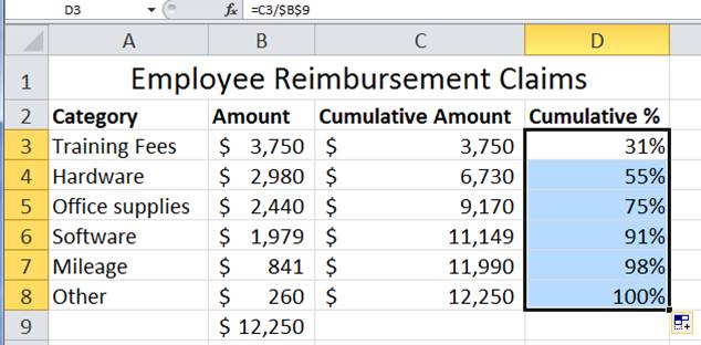
6) Next, create a Cumulative Percent column. You can use the Amount total and each cumulative amount to build this column. In the function bar for D3, type "=C3/$B$9" and Enter. The "$" figures create an absolute reference so that the Amount total (B9) does not change when you drag the formula down.
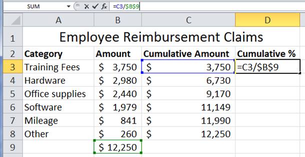
7) Now either double click on the Auto Fill Handle to fill in your data or click and drag the handle down your column of data.
8) You now have what you need to start your Pareto chart!
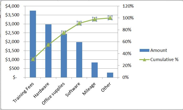
How to Create a Pareto Chart Manually in Excel
With your data prepared, you can now build the chart step by step. The manual method works in any version of Excel and gives you full control over every element. You'll create a bar chart for the individual values, then add a cumulative percentage line on a secondary axis so the percentage scale runs from 0% to 100% independently of the dollar amounts.
Insert the Bar Chart and Remove Extra Series
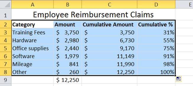
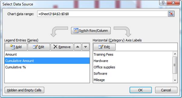
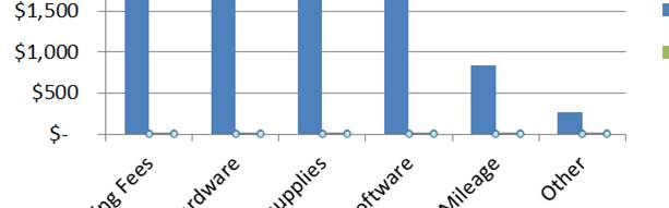
1) Highlight your data (from B2 to D8 in this example).
2) Quick Tip: Press ALT and F1 on your keyboard to automatically create a chart from the data.
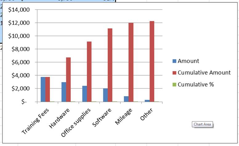
3) Right click in the Chart Area and select Select Data. The Select Data Source dialog box appears. Select Cumulative Amount and choose Remove. You only need the Amount bars and the Cumulative % line, so removing this extra series keeps the chart clean. Then choose OK.
Add the Cumulative Percentage Line on a Secondary Axis
The secondary axis is what makes a Pareto chart work. Without it, your cumulative percentage line would be compressed against the bottom of the chart because the dollar values on the primary axis are so much larger. The secondary axis gives the percentage line its own 0%-to-100% scale on the right side.
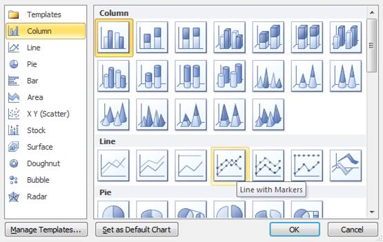
4) Click in the chart and use your keyboard's arrow keys to toggle between areas on your chart. When Cumulative % is highlighted on the x-axis, hover and right click Change Chart Series Type.
5) The Change Chart Type dialog box appears and pick a line graph.
6) You now have a bar chart with a flat line graph along the x-axis. In order to get a curve to our Cumulative % line, we need the other vertical axis.
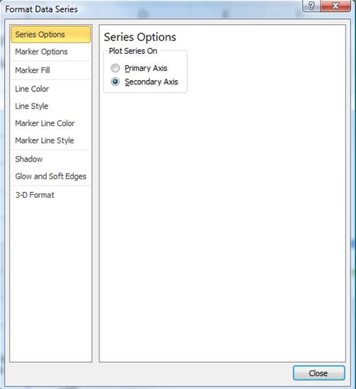
7) Right click on the Cumulative % line and choose Format Data Series. The Format Data Series dialog box appears.
8)Choose Secondary Axis under Series Options then click Close.
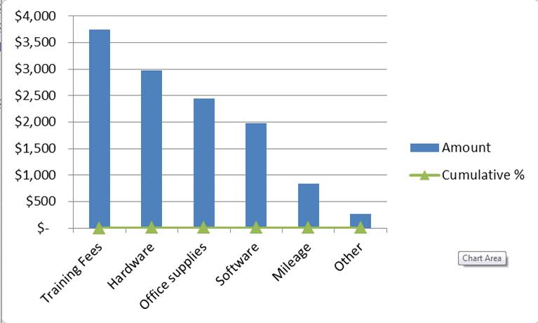
9) Now you have a Percentage Axis and a complete Pareto chart!
Our findings: training fees, hardware and office supplies make up the bulk of our expenses.
How to Customize Your Pareto Chart
A basic Pareto chart gets the job done, but a few formatting touches can make it much easier to read and more effective in presentations and Excel dashboards.
- Add an 80% reference line. Insert a horizontal line shape or add a constant data series at 80% on the secondary axis, then format it as a dashed line. This makes the 80/20 cutoff immediately visible.
- Format data labels. Add value labels to the bars or percentage labels to the line so readers can see exact figures without referencing the axes.
- Adjust bar colors. Use a single color for all bars, or highlight the bars that fall within the 80% threshold in a contrasting color to draw attention.
- Add a descriptive chart title. Replace the default title with something specific, like "Employee Reimbursement Costs by Category."
- Remove unnecessary gridlines. Reducing visual clutter helps the bars and line stand out. Keep only the horizontal gridlines on the primary axis if needed.
These small adjustments turn a functional chart into one that communicates your findings clearly to any audience.
Common Mistakes to Avoid When Making Pareto Charts
Even experienced Excel users run into issues with Pareto charts. Watch out for these common pitfalls:
- Not sorting data in descending order. If your bars aren't arranged from largest to smallest, the cumulative percentage line won't curve correctly and the chart loses its analytical value.
- Forgetting the cumulative percentage line. Without it, you just have a bar chart. The line is what turns a simple comparison into a prioritization tool.
- Including too many small categories. If you have dozens of minor items, group the smallest ones into an "Other" bucket. Too many tiny bars make the chart hard to read and dilute the focus.
- Using the wrong chart type. A Pareto chart is not a histogram. Make sure your x-axis shows distinct categories, not continuous data ranges.
- Not labeling axes clearly. Readers need to know what the left axis (values) and right axis (cumulative percentage) represent. Always label both.
- Misinterpreting the results. The chart shows you where to focus, but it doesn't explain why those categories are dominant. Use the Pareto chart as a starting point for deeper investigation.
Put Your Excel Skills to Work
A Pareto chart is one of the most practical tools you can add to your data analysis toolkit. Whether you use the built-in option for quick insights or build one manually for full control, the ability to visualize the vital few causes behind your biggest challenges is a skill that pays off across every role and industry.
Now that you have the step-by-step tips to set up and create a Pareto chart in Excel, give it a try. You can apply Pareto analysis to identify your biggest problem areas and make a huge impact by addressing them.
Ready to sharpen your Excel skills further? Pryor Learning offers hands-on Excel training courses that cover charts, formulas, data analysis and more. Explore Pryor's Excel training to take your skills to the next level.


