Gantt Charts, Project Management
May 5, 2026
Excel Gantt Chart Template: Free Downloads and Step-by-Step Guide
Key Takeaways:
- Excel doesn't include a native Gantt chart type, but you can create one using a stacked bar chart or download a free template to get started immediately.
- A well-built Excel Gantt chart tracks task names, start dates, durations and task dependencies so your project timeline updates when plans change.
- For simple projects, an Excel Gantt chart is a powerful, no-cost solution. For complex projects with many resources and dependencies, dedicated project management tools may be a better fit.
A Gantt chart is one of the most widely used project management visuals. It displays tasks as horizontal bars along a timeline, making it easy to see what needs to happen, when it starts and how long it will take. Whether you're coordinating a product launch, planning an office renovation or tracking a team's quarterly goals, a Gantt chart gives you a clear picture of your project timeline at a glance.
Excel doesn't have a built-in Gantt chart type, but that doesn't mean you need expensive software to create one. With a few formatting tricks, you can turn a standard stacked bar chart into a fully functional Gantt chart right inside Microsoft Excel. This article provides free Excel Gantt chart template options you can set up immediately, plus a complete step-by-step tutorial for building one from scratch.
If you want to sharpen your Excel skills beyond Gantt charts, Pryor Learning offers hands-on Excel training courses that cover formulas, charts, data analysis and more.
Free Excel Gantt Chart Templates
Before diving into a tutorial, you may want a ready-made free Gantt chart template in Excel you can start using today. Below are four template types suited to different project sizes and needs. You can build each of these yourself using the instructions later in this article, or search Microsoft's built-in template gallery (File > New > search "Gantt") for similar starting points.
- Simple Gantt chart template - Includes columns for task name, start date and duration. Best for straightforward projects with five to 10 tasks and no linked dependencies. Ideal for personal to-do tracking or small team assignments.
- Dependency Gantt chart template - Adds columns for predecessor tasks, gap days and calculated start dates using formulas. Best for projects with 10 to 25 tasks where phases must happen in sequence.
- Weekly/monthly Gantt chart template - Uses a week-by-week or month-by-month horizontal axis instead of individual dates. Best for high-level planning across a quarter or year, such as marketing campaigns or product roadmaps.
- Multi-project portfolio template - Stacks multiple project timelines on a single chart with color-coded bars for each project. Best for managers overseeing several initiatives at once who need a consolidated project timeline view.
Choosing the Right Template for Your Project
Match your template complexity to the size and structure of your project:
- Five to 10 tasks, no dependencies: Use the simple template. It takes minutes to set up and keeps things clean.
- 10 to 25 tasks with linked phases: Use the dependency template so your dates recalculate automatically when one task shifts.
- Long-range planning (quarterly or annual): Use the weekly/monthly template to avoid cluttering the timeline with individual dates.
- Multiple simultaneous projects: Use the portfolio template to give stakeholders a single view across all active work.
How to Create a Gantt Chart in Excel Step-by-Step
If you'd rather build your own Gantt chart in Excel from scratch, the process below walks you through every step. This approach uses a stacked bar chart "hack" that works in Excel 365, Excel 2021 and earlier versions. The result is a dynamic chart tied to your data, so it updates whenever your task dates or durations change.
Set Up Your Data Table with Dependencies
Divide your project into specific tasks to be completed. For each task, you'll need the following fields:
- Task name - A short, descriptive label for the task.
- Target start date - When do you want the task to begin?
- Dependency - Does this task depend on the completion of another task?
- Gap - If it depends on another task, how many days between that task's completion and this task's start?
- Duration - How many days will this task take?
- Calculated start date - Determined by formula based on the dependency and gap.
- Calculated end date - Determined by formula based on the start date and duration.
From those input fields, your spreadsheet formulas can calculate the actual start and end dates.
Building the formulas: To make your task dependencies work automatically, use a formula in the Start Date column that checks whether a dependency exists. For example, if your dependency column is D, your predecessor's end date is in column G of the referenced row and your gap is in column E, a formula like this works:
=IF(D3="", C3, INDIRECT("G"&MATCH(D3, A:A, 0)) + E3 + 1)
This tells Excel: "If there's no dependency, use the target start date. Otherwise, find the predecessor's end date, add the gap days and start the next day." Your end date column is then simply =F3 + G3 - 1 (start date plus duration minus one).
For example, suppose you plan to have your new conference room painted by June 1, and that you plan to hang pictures one day after painting is complete. Your task "Hang pictures" would depend on the completion of "Paint," and it would have a gap of one day.
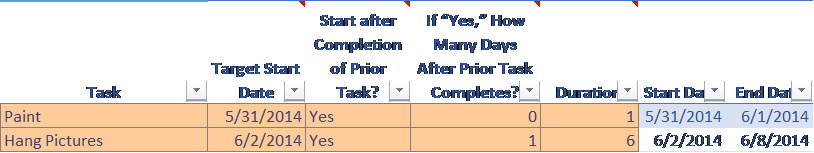
Now suppose that the painting is not complete until June 3. Because "Hang pictures" can't begin until one day after painting is complete, the calculated start date must change to June 4.

Build and Format the Stacked Bar Chart
Microsoft Excel does not have a chart type named Gantt, but we can hack the stacked bar chart and make it function like a Gantt chart. Follow these steps in Excel 365 or Excel 2021 (notes for older versions are included where the process differs).
1) Drag your mouse to highlight your data table.
2) From the Insert ribbon, click Insert Bar Chart and select 2D Stacked Bar.
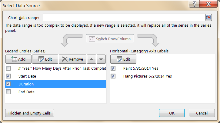
3) Right-click the chart and choose Select Data. Under Legend Entries, deselect all of the automatically included columns except Start Date and Duration.
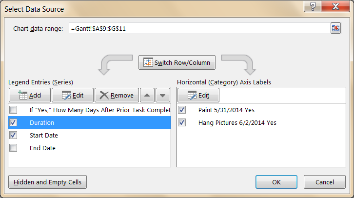
4) Click on Duration and click the down arrow to move it below Start Date.
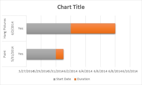
5) Click OK. Your chart should look like this:
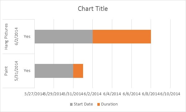
6) Before completing the next steps, take a moment to select a format from the Chart Design ribbon (labeled Chart Tools | Design in older versions). This is the same chart after selecting Style 11:
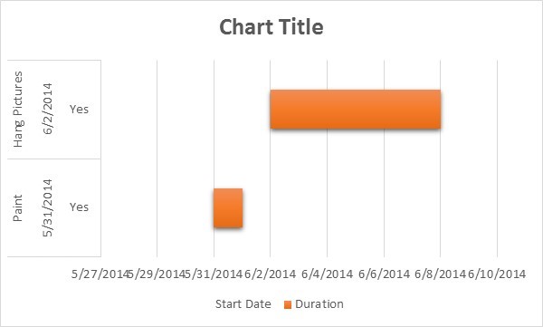
7) Next, get rid of the gray bars. Right-click on one of the gray sections and choose Format Data Series.
8) In the formatting pane, choose Fill & Line and then Fill. Choose No Fill. (In Excel 2010, choose Fill in the dialog box instead.)
9) Next choose Border and No Line.
10) Choose Shadow, Glow and Soft Edges, and in each case choose none. Now the gray bars are invisible.
11) Your chart should look like this:
12) Click on Chart Title and change it to the title you'd like to display.
13) Click on the legend at the bottom and press the Delete key.
14) To show the first task at the top of the chart, right-click on the vertical axis (which, in this example, displays "Paint 5/31/2014" and "Hang Pictures 6/2/2014") and click the checkbox for Categories in reverse order.
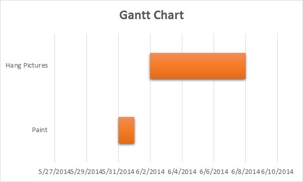
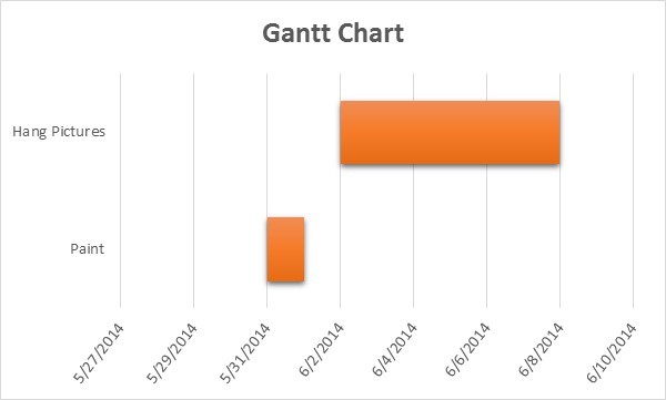
15) Finally, adjust other formatting to your taste. For example, you can adjust the dates on the horizontal axis to avoid running together, remove some of the white space between the chart rows and change the format of the text on the axes
Additional customization tips: Once your basic Gantt chart is working, consider these enhancements to make it more professional and useful:
- Color-code by status. Use different fill colors for completed, in-progress and not-started tasks. Right-click individual bars to change their fill color.
- Add milestones. For zero-duration milestone events, add a task with a duration of one day and format its bar as a narrow diamond or distinct color so it stands out.
- Use conditional formatting in your data table. Apply conditional formatting rules to highlight overdue tasks in red or completed tasks in green, making the underlying data easier to scan.
- Optimize for printing. Switch to landscape orientation, adjust the chart size to fit one page and increase font sizes on the axes so the chart is readable when printed.
When to Use Excel vs. Dedicated Project Management Software
An Excel Gantt chart template is a smart choice for many projects, but it's not the right tool for every situation. Here's an honest look at when Excel works well and when you might benefit from dedicated project management software like Microsoft Project, Smartsheet or similar tools.
Pros of using Excel for Gantt charts:
- Free if you already have a Microsoft 365 subscription or Excel license
- Familiar interface with no learning curve for most professionals
- Fully customizable layout, formulas and formatting
- Easy to share as an email attachment or print for meetings
- No vendor lock-in or recurring subscription for a separate PM tool
Cons of using Excel for Gantt charts:
- No real-time collaboration unless using Excel for the web (and even then, it's limited)
- Manual updates required for complex dependency chains
- No built-in resource leveling, critical path analysis or workload balancing
- Charts can become unwieldy with more than 25 to 30 tasks
- Version control issues when multiple people edit the same file
| Feature | Excel Gantt Chart | Dedicated PM Software |
|---|---|---|
| Cost | Free with Excel license | $10–$50+ per user/month |
| Ease of setup | Moderate (requires formatting) | Built-in Gantt views |
| Dependency tracking | Manual formulas | Automatic with drag-and-drop |
| Real-time collaboration | Limited | Full team collaboration |
| Resource management | Not built in | Workload and allocation tools |
| Critical path analysis | Not built in | Automatic |
| Best for | Small-to-mid-size projects | Complex, multi-team projects |
For most professionals managing straightforward projects, Excel delivers everything you need. If you want to get more out of Excel for project tracking and beyond, Pryor Learning's Excel training courses build the skills that make tools like Gantt charts second nature. And if your projects are growing in complexity, Pryor's project management training can help you decide when and how to level up your toolkit.


