Among the most useful Excel tools are those that help you visualize your data in meaningful charts and graphs. When it comes to visualizing date and time information, however, analysis can get messy and charts can be difficult to format into clear communication. Let’s look at some tips and tricks you need to get the most of your Date and Time data.
Use an XY - Scatter Chart
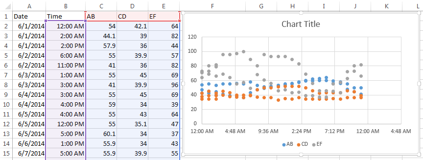
By far the easiest way to chart time data is to use a scatter chart. Scatter charts will automatically take date or time data and turn it into a time-scale axis. When you select a date or time range and the data associated with it, Excel will take its best guess at organizing the information in the chart with the time-scale on the x-axis.
However, Excel's best guess might not be as useful as you need it to be. In this example, we want to see how, or if, our series data are affected by the time of day. The resulting scatter chart does a nice job of plotting the series data, but the timeline defaults to what seems to be random units of time.
To adjust how the x-axis time-scale is displayed:
- Click on the chart to open the Format Chart Area Pane
- Click on Chart Options and select Horizontal (Value) Axis
- Click the Axis Option Icon
- Open the Axis Options dropdown triangle
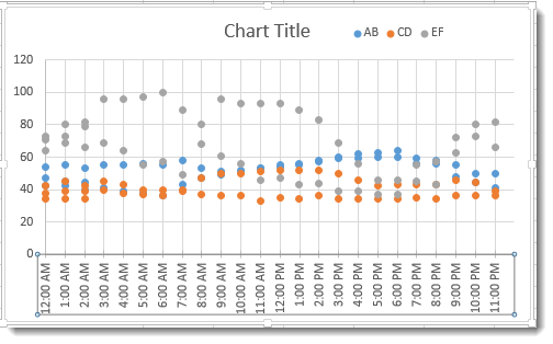
- Make changes to the Bounds, Units, and so on to adjust the time-scale to display the chart in the manner you wish.
You may have to play with the Units settings to get your scale to show the time increments you want. In this example, we wanted our unit markers to appear every hour and the chart covered 24 hours of data. So, our Unit setting equals 1 / 24 or .04167. A setting of .25 would show Unit markers at 12:00 a.m., 6:00 a.m., 12:00 p.m. and 6:00 p.m.
The results are a clean, uncluttered chart that plots series data evenly and clearly across a 24 hour period.

Make sure Axis Type is set to Date Axis
When you are creating a line, column or bar chart, Excel will automatically treat date data as a "Date axis". This means that each data point will be plotted on the x-axis based on linear time, rather than equal distance from each other.

AB – Text shows the x-axis set to Text axis and the data points are equally spaced across the chart, even though the dates are not even throughout the month.
AB-Date shows the x-axis set to Date axis and the data points are further or closer together based on when the data was recording during the month. If AB represented bank account withdrawals, you can more easily see in AB-Date that more transactions take place in the middle and end of the month. Follow the steps above to open Axis Options to set your x-axis to Date Axis if Excel's default chart does not do so.
Hint: If your date data is entered as text instead of the Date format, then the Date Axis option will not work. Change your data to the Date format to take advantage of Date Axis.
What about Time Data on Line Charts?
Sadly, as of Excel 2013, the Date Axis feature does not work on Time data in Line, Column, and Bar charts. If you try, you get something like this:

If you need to plot information over time, the easiest solution is to use an XY Scatter Chart and add Lines and Markers to resemble a Line Chart.

Create a PivotChart for Date Data
Pivot tables are among Excel’s most useful tools for analyzing large sets of data. Let’s look at how to visualize the powerful results of a PivotTable in a PivotChart.
Begin by making sure your data is organized properly into a table with no blank rows or columns, column headers, and entered consistently in date or time format (e.g., 6/10/24 15:00:00).
- Place your cursor in the top left cell of your table, then click the PivotChart command on the Insert tab.

- Confirm that the Table/Range is correct in the Create PivotChart dialog, and select the location of your chart. Click OK.

- You will now build your PivotChart by adding fields to the PivotChart areas. In this example we want to see:
a. Sales totals (Order Amount goes in Values are)
b. By month (Order Date goes in Axis area)
c. For each Salesperson (Salesperson goes in Series area)
Excel will automatically group the date data based on the data itself. In this case, it chose to group by Month. The PivotTable is created at the same time as your chart.