Charts, Excel
Apr 30, 2026
How to Create an Excel Gauge Chart (AKA Speedometer Charts)
Key Takeaways
- An Excel gauge chart (also called a speedometer chart) is built by combining a doughnut chart and a pie chart, with no add-ins required.
- The doughnut chart creates the colored dial, while the pie chart acts as the needle that moves dynamically based on your data.
- Gauge charts work best for displaying a single KPI against a target range on dashboards.
- This tutorial includes downloadable Excel files so you can follow along and check your work.
What Is an Excel Gauge Chart?
You might think you need some fancy add-ins to create charts that look like a speedometer. An Excel gauge chart, also known as a speedometer chart, is a visual that displays a single value against a colored scale, much like the speedometer in your car. It gives viewers an instant read on whether a metric is on track, falling behind or exceeding expectations.
Excel does not include a native gauge chart type. Instead, you build one by layering a doughnut chart (for the half-circle dial) with a pie chart (for the needle). The result is a polished, dynamic visual you can drop into any report or Excel dashboard.
Common use cases include:
- KPI dashboards that track a single metric at a glance
- Performance tracking against a goal or threshold
- Project progress indicators
- Executive reports where simplicity matters
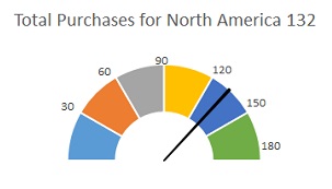
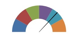
In this tutorial, you'll learn how to create the snazzy image below from a pie chart and a doughnut chart.
When to Use a Gauge Chart
A speedometer gauge chart is a great choice in some scenarios and a poor fit in others. Before you build one, consider whether it's the right visualization for your data.
Use a gauge chart when:
- You need to display a single metric against a defined range
- Your audience needs an at-a-glance status indicator
- You're building a KPI dashboard with limited space per metric
Consider a different chart type when:
- You need to compare multiple values side by side
- You want to show trends or changes over time
- Precise numeric detail matters more than a quick visual read
| Scenario | Best Chart Type | Why |
|---|---|---|
| Single KPI vs. target | Gauge chart | Instant visual status |
| Comparing categories | Bar chart | Easy side-by-side comparison |
| Tracking trends over time | Line chart | Shows direction and patterns |
What You Need Before You Start
Before diving into the steps, make sure you have the following ready:
- Excel 2010 or later — this tutorial covers version-specific instructions for both Excel 2010 and Excel 2013+
- Basic familiarity with inserting charts in Excel
- The practice file so you can follow along step by step
Download CreatingGaugeChart.xlsx to follow along.
Now let's learn how to create a gauge chart in Excel.
How to Create an Excel Gauge Chart Step by Step
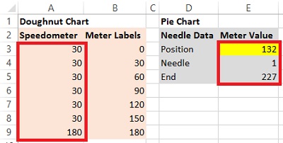
1) Create the data for the speedometer.
If a circle is 360 degrees, then a half-circle is 180. The number and value of intervals depends upon how detailed you want to be. In the sample file, we've set up six intervals which add up to 180. Select all seven cells (the six interval values plus the total row).
2) Create the data for the needle.
We'll also need three cells that contain:
- Position of the needle, your actual data value
- Width of the needle, which is always one
- A formula which subtracts the sum of these values from 360
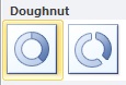
3) Create the speedometer with a doughnut chart.
Next, we'll create our first chart. Select the 7 cells for your Speedometer and insert a Doughnut Chart. You'll find this in Excel 2010 on the drop down button named Other Charts. In later version, you'll find it in the drop down button for Pie Charts.
Note: While you can use the F11 shortcut to create a chart. For this activity, it's best to create the chart in the same worksheet as the data to make all the necessary modifications easier.
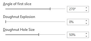
4) Modify the chart to look like the half-circle dial.
Right click the chart and choose Format Data Series. We'll make three changes:
- First, change the Angle for first slice by typing in the number 270 and pressing Enter.
- Next, change the doughnut Hole Size to 50%.
- Finally, right click the wedge on the bottom and choose Format Data Series. Change the Fill to none.
5) Add needle data as a pie chart.
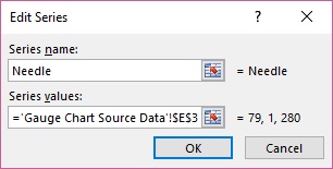
Right click the gauge chart you just created and choose Select Data. Click the Add button and Name the new series "Needle." Navigate to the Series values field and select the Position, Needle and End data. Click OK out of this dialog box.
The next steps differ depending on your Excel version. Follow the set of instructions that matches your version below.
Excel 2010 and Earlier:
- Right click the outer doughnut and choose Change Series Chart Type.
- Choose Pie.
- Right click the pie or, in the Layout tab in Excel 2010, in the first field in the ribbon, choose Series "Needle", then Format Selection, below it.
- Change the Angle of the first slice to 270. Then, click the radio button for Secondary Axis.
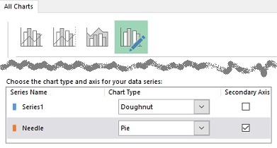
Excel 2013 and Later:
- Right click the pie chart and choose Change Series Chart Type.
- Choose Combo Chart.
- Change the Chart Type for the Needle series to Pie.
- Check the Secondary Axis check box.
Note: If right clicking proves tricky, click in the Chart Elements field on the Layout tab (2010) or Format tab in later versions. Then, use the Shift+F10 shortcut to show the "right click" menu.
6) Modify the pie to look like a needle.
Whether it's obvious or not, there are three slices: two large ones and one tiny one that represents the needle. Right-click each of the two large slices and choose Format Data Series to remove the Fill and Border. (Tip: Shift+F10 for the right-click menu.) If you want to change the color of the needle, it might be best to zoom in to make sure you're just selecting the 1 point wedge.
Finishing Touches
As you change the value in Position, you'll see the needle move. However, it would be helpful to see some numbers here to complete the picture.
Next to the values we used for the doughnut chart, cumulative values have been entered from zero through 180. We'll use the non-zero values to add data labels which will be the meter positions against which we'll view the needle.
Using the Layout tab method, select Series1 (in 2013, choose the Format tab). Use the Shift+F10 shortcut or use the "right click key" on your keyboard. Choose Add Data Labels.
Click the bottom (180) label and delete it. For each of the remaining labels, click the label. Then, in the Formula bar, type an "=" and click on the appropriate meter label value. Drag them to the right places on the gauge.
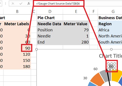
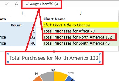
The legend really doesn't inform anything here, so we can delete it. Let's add or modify the Chart Title. The sample data already has chart titles. Select the words Chart Title and click into the Formula bar. Type an equal sign "=" and then click on the cell with the appropriate chart title.
Download CreatingGaugeChart-Complete.xlsx to see how you did!
Tips for Customizing Your Gauge Chart
Once your basic gauge chart is working, there are several ways to take it further:
- Color your zones. Format individual doughnut slices with green, yellow and red fills to represent good, warning and critical ranges—an approach similar to how conditional formatting highlights cells by value. This makes the chart instantly readable on any KPI dashboard.
- Adjust needle width. Change the needle width value from one to two or three if you want a thicker, more visible pointer.
- Resize for dashboards. Shrink the chart and remove gridlines, titles or labels you don't need so it fits cleanly into a multi-chart Excel dashboard layout.
- Use Data Validation and VLOOKUP. Advanced users can add a dropdown list with Data Validation and a VLOOKUP formula to let viewers select different metrics, automatically updating the needle position and chart title. These techniques pair well with dashboard design with VBA for fully interactive reporting.
- Consider add-ins for speed. Third-party tools like Power-user can generate gauge charts with a few clicks. They require additional software, but they save time if you build these visuals frequently.
Conclusion
Building an Excel gauge chart from scratch gives you full control over the design, colors and data connection without relying on paid add-ins. Now that you have a working template, experiment with different interval ranges, color schemes and needle values to match your reporting needs.
Want to sharpen your Excel skills even further? Explore Pryor Learning's Excel training courses to master advanced dashboards, formulas and data visualization techniques.


