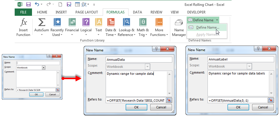
Assign Chart Data Source to Dynamic Named Range
Create your line chart as you normally would if you have not already. Now, you need to tell the chart to use our dynamic range instead of the entire table. Click on the chart to activate the Chart Tools contextual tabs.
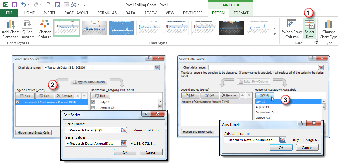
- On the Design tab, click Select Data.
- In the Select Data Source dialog box, select the first data series and click
- In the Series values: text box in the Edit Series dialog box, replace the default table range with the dynamic data named range. Do not change the sheet name and exclamation (!) that precedes it.
- Click OK
- Click on any label in the Horizontal (Category) Axis Labels selection box, then click
- In the Axis Labels dialog box, replace the default range with the dynamic label named range.
- Click OK.
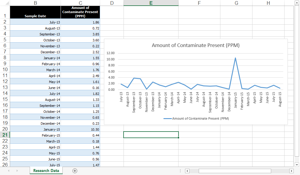
Now your chart will only show the last 12 rows of data.
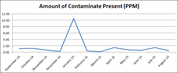
When you update your data by adding more rows, the chart will automatically show the new last 12 rows of data, creating a rolling chart effect.
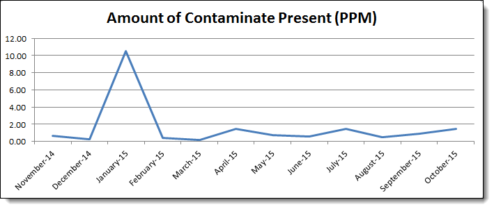
Note that if you want to show more than one series of data on your chart, you will need to create a named range and repeat the above process for each series! This might take you a little more time to set your charts up, but will save you much more in the long run as you simply add to your data and the chart does the rest.
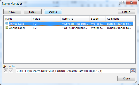
Bonus! Changing Names
Once you have specified named items in your workbook, you may want to go back and edit them from time to time. Perhaps you want to change your OFFSET to show 6 months instead of 12, for example. To edit an existing name, click the Name Manager button on the Formulas tab. Select the name you wish to edit, then click the Edit button. Make your changes in the dialog box as you did when first creating it. Just be careful not to change the name itself if other formulas depend on it.
OPTIONAL: To check your work and compare named ranges, you can download Excel Rolling Chart_Complete.xlsx.