As a continuation of our post last week, we decided to expand on some great uses from conditional formatting. Highlighting negative values in red and using several built-in conditions is great when you are starting out, but you are not getting nearly enough bang for your buck! Here are three ways to get more out of Excel's useful conditional formatting tools. Images in this article were taken using Excel 2013 on the Windows 7 OS. The steps apply to Excel 2010-2016.
To follow using our example, download FPS_Apply Conditional Formatting.xlsx
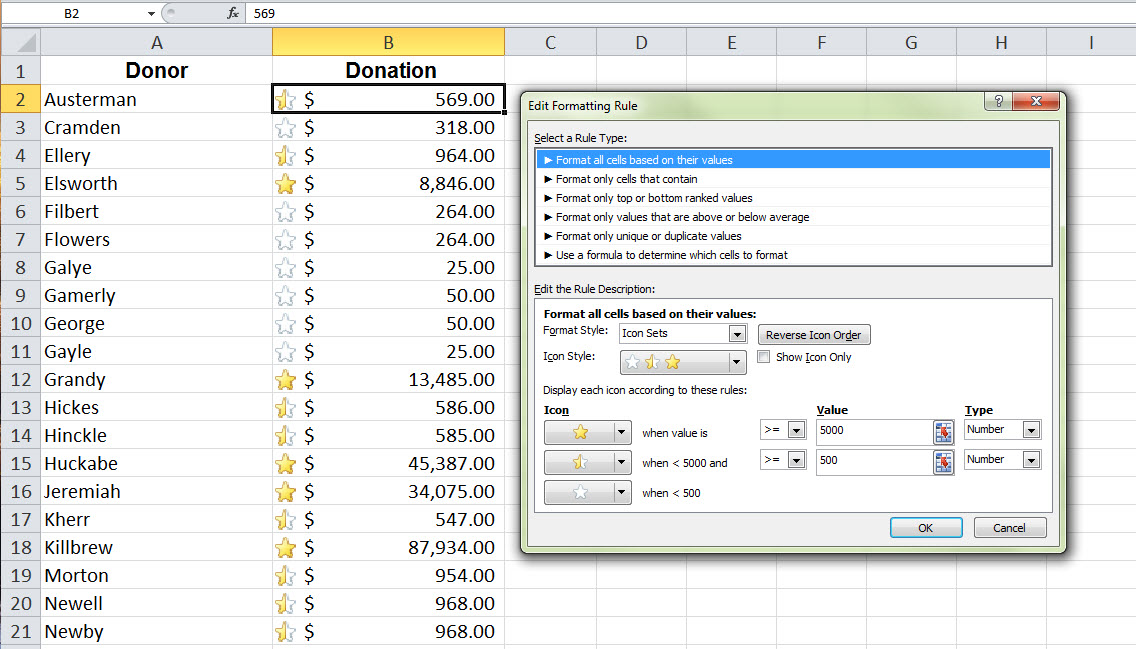
Use Icons Instead of Formatting
When you want a little more visual interest than colored text and backgrounds, you can use conditional formatting to display icon sets.
How to do it:
- Select the column or data range.
- Open the New Formatting Rule dialog box by clicking the Conditional Formatting dropdown button and selecting New Rule. (You can use the Icon Sets option in the dropdown menu if default settings are acceptable.)
- In the Format Style dropdown menu, select Icon Sets.
- Choose the type of icons you want in the Icon Style dropdown.
- In the lower half of the dialog, you can set specific criteria for how each icon is displayed. In this example, we want:
- Donors who gave 5000 and up to show a full yellow star
- Donors who gave 500-5000 to show a half yellow star
- Donors who gave 500 and less to show an empty star
You can display icons based on percentages and custom formulas by changing the Value and Type criteria.
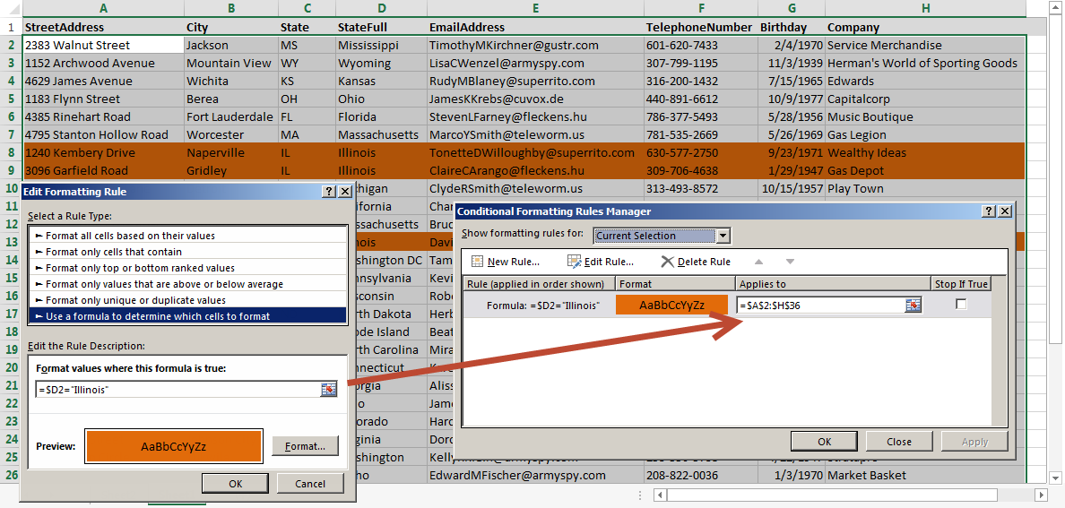
Highlight an entire row or column
When you are looking at data that has many columns, highlighting just one cell might not be enough for you to see the whole picture. Instead, highlight the whole row!