Charts, Excel
Dec 10, 2015
How to Make a Radar Chart in Excel
Pie charts, bar charts and line charts are familiar friends to Excel users. But there's a less well-known chart out there that can pack a lot of information into a single, visually powerful image. The Radar Chart, also sometimes called a spider or star chart, lets you compare multiple items against multiple criteria. You could use it to see how temperatures change in multiple locations over the course of a year, or quickly compare products in several different areas.
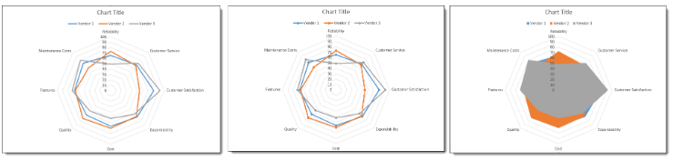
We are going to create a chart that will help us choose a new phone system for our office. We have gathered information from three different vendors and given each a performance score of 1-100 in eight areas that are important to us such as reliability and maintenance costs. Our table conveys the information, but doesn't really help us understand which vendor might perform best overall, if any do.

To follow using our example, download Create a Radar Chart.xlsx This article applies to Excel 2007 and later versions. Images were taken using Excel 2013 on Windows 7.
Create a Radar Chart
- Select the data that you want to use for the chart.
- On the Insert tab, click the Stock, Surface or Radar Chart button and select an option from the Radar A preview of your chart will be displayed to help you choose.
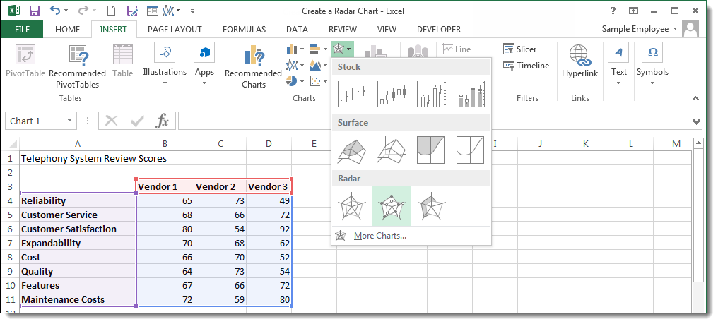
Note: In Excel 2010, the Radar charts are located under the Other Charts button.
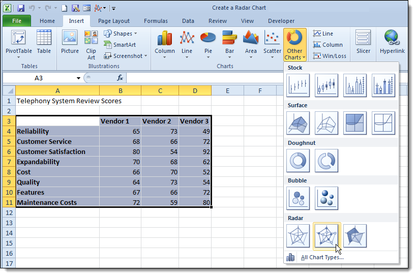
There are three default Radar charts you can choose from: Basic Radar, Radar with Markers, and Filled Radar.
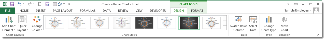
Once your chart is created, you can customize the colors, labels, and text as you would any chart. Click on the Design and Format tabs in the Chart Tools contextual tab to find Chart styles and other editing tools.
The radar chart is one of those "love it or hate it" tools. This is probably because there is some data that it works really well for, and for some it merely creates confusion and annoyance. The trick is to use it sparingly, and only on those specific tasks to which it is most suited.


