Professional Training for More Than 50 Years
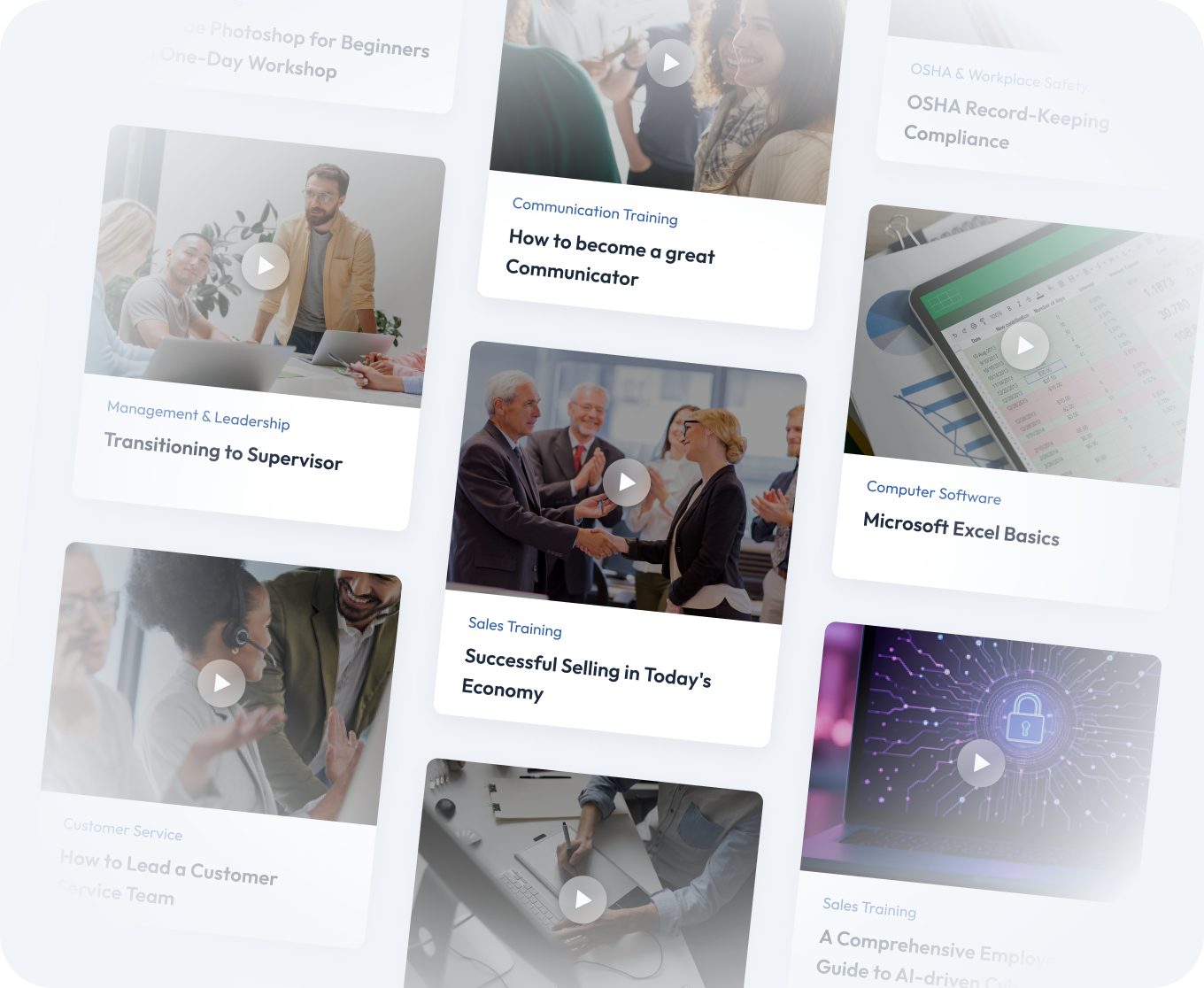
Top training categories to enhance your career

AI On-Demand Library
Get instant access to 90+ practical, self-paced courses built for real workplaces and real schedules. Every course is built around the tasks that matter most in your workday.
Popular Courses Included:
- AI Business Essentials Part 1: ChatGPT
- Copilot for Excel: An Introduction
- Copilot for PowerPoint: An Introduction
- Getting Started with Claude
Trusted by 3M+ organizations and 13M+ individuals
Features
Choose from thousands of courses spanning leadership, HR compliance, communication, productivity, and more.
Whether you need quick skills refreshers or in-depth certification, the Pryor Learning catalog has it covered.
Live in-person seminars, virtual instructor-led sessions and on-demand eLearning — designed to fit every budget, team size and learning style.
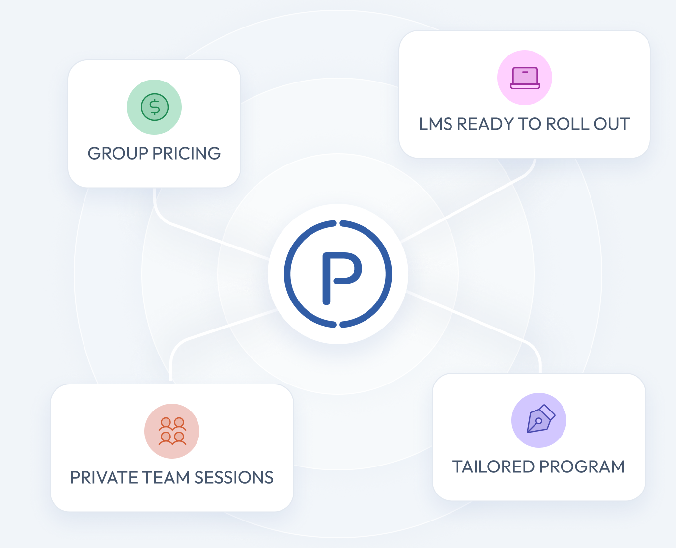
Scalable training programs with customization options for organizations, including group pricing, private team sessions and LMS integration for seamless rollout.
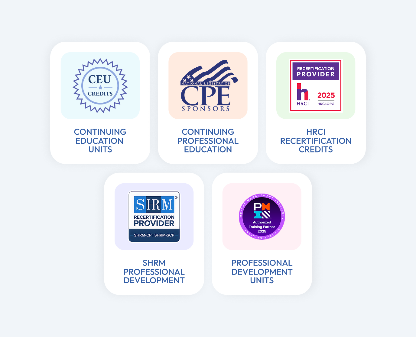
Many courses offer CEUs, CPE, HRCI, SHRM and other continuing education credits, giving learners career-boosting credentials while companies stay compliant.
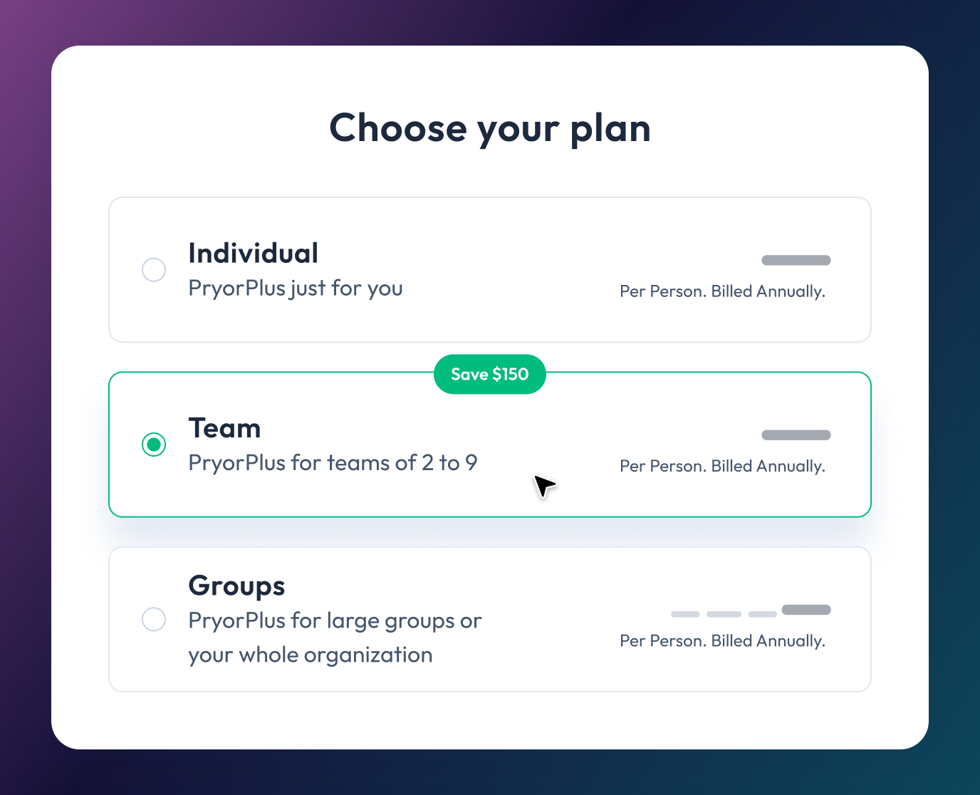
The PryorPlus annual pass gives individuals or teams unlimited access to training at a fraction of the cost of traditional programs.


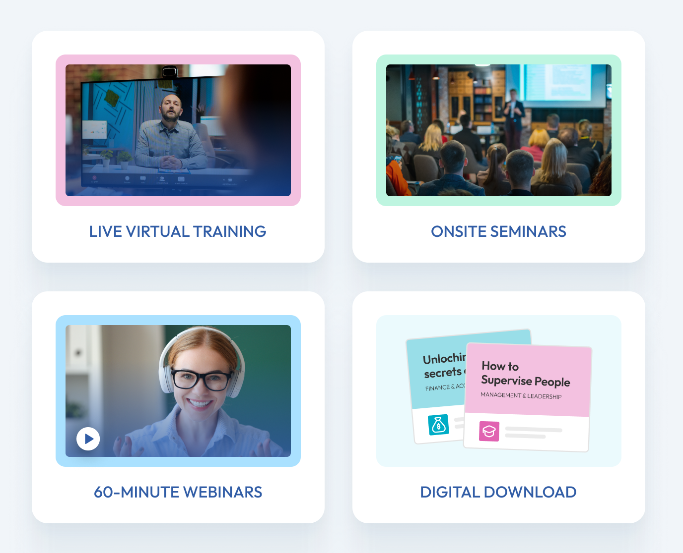
Live Virtual Training
Experience interactive learning and live instruction provided by dynamic thought leaders. Our seminars are led by a real person — an experienced trainer who engages with you, facilitates discussion and answers your questions in real time. Pryor Learning offers these training options in-person, online in a virtual setting or onsite at your location.

In-person Training Events
Looking for a training alternative to online courses? Experience an in-person seminar from Pryor Learning in a city near you. Sessions are held in an environment with limited distractions and led by an experienced trainer who engages with you, facilitates discussion and answers your questions in real time.

Webinar Training
Pryor Learning offers 200+ webinar topics designed to help you upskill quickly—whether live online or on your own schedule. In just 60 minutes, build expertise in high-demand areas like management, leadership, communication, customer service, Excel and more.
Better training in more formats—for less money.

Professional and accredited training solutions for all organizations—from startups to the Fortune 500.
We provide flexible and personalized training for organizations of any size, whether you need to brush up on computer skills, train for a new role or upskill your team on the latest business trends.
Learning that will ignite, inspire and upskill you.
We offer training that goes above and beyond for you—regardless of location, time, topic or method of delivery. We offer many learning options to help you grow and succeed.


Federal, state and local agencies can boost performance and staff engagement with Pryor Learning.
We partner with government agencies to ensure you meet and maintain certain federal requirements. Leverage Pryor’s custom-tailored and P-card-ready training to streamline workforce performance, while reducing liability and increasing employee engagement and productivity.
Award-Winning Training


Learn all year long
PryorPlus
Train big with pricing options for every budget.
- 5,000+ recorded and on-demand courses covering 19 learning categories
- Live virtual seminars led by expert instructors in real time
- Live in-person seminars at convenient locations across the U.S.
- Microlearning, quizzes, videos and eBooks
- Professional certifications: CEU, CPE, HRCI, PDC and PDU